Email Design · Brand
HearingLife
A single eblast, redrawn — new hierarchy, one clear action, and a more legible path to a younger audience.
Overview
- Discipline
- Email Design · Brand
- Role
- Design & production
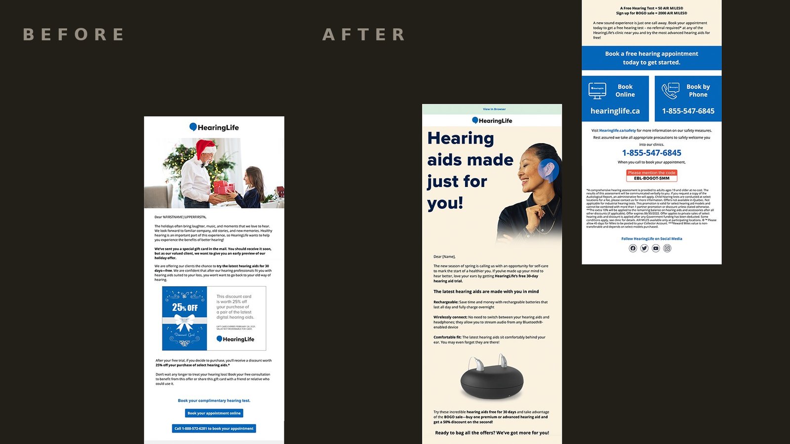
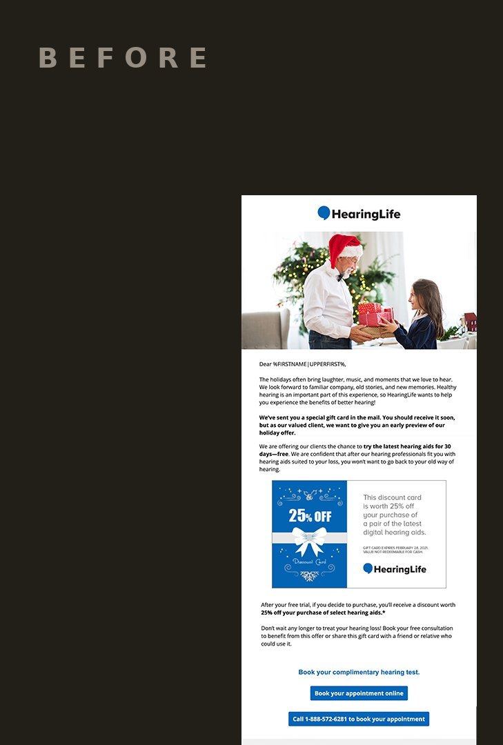
HearingLife is a long-established Canadian hearing-health provider whose email programme had, over time, drifted toward the habits of an older audience: dense layouts, competing priorities, and a tone that leaned on familiarity rather than invitation.
The brief was deliberately narrow — modernize the email’s voice and format for a younger demographic without surrendering the brand’s authority. The response was equally focused: a single, documented before-and-after redesign of a core eblast.
Approach
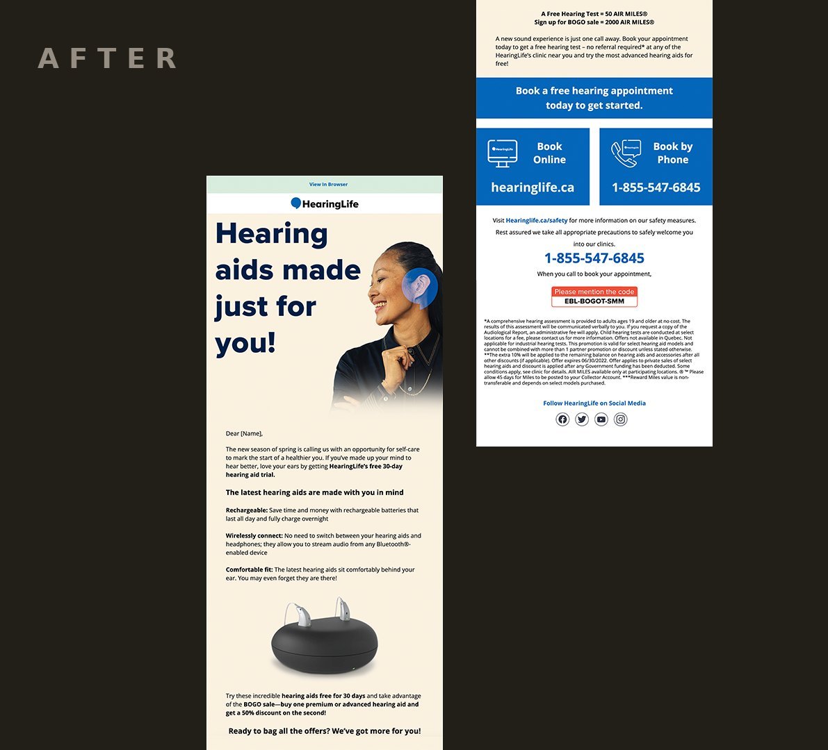
The original layout carried the marks of email built for a different era: cluttered hierarchy, no clear resting point for the eye, and a call to action buried among competing messages. The redesign stripped the composition back to its essential job — bring the right person to a booking.
A clean, legible structure replaced the dated format, centred on a single headline — “Hearing aids made just for you” — and one unambiguous booking call to action. The intervention was precise rather than sweeping: every decision served the task of making the email feel contemporary without erasing the trust the brand had earned over decades.
Gallery
Outcome
A production-ready direction — a documented, restrained modernization showing how HearingLife’s email could reach a broader audience while holding its authority.