Brand Identity
soomoo
A mark whose softness is its argument.
Overview
- Discipline
- Brand Identity
- Role
- Design & production
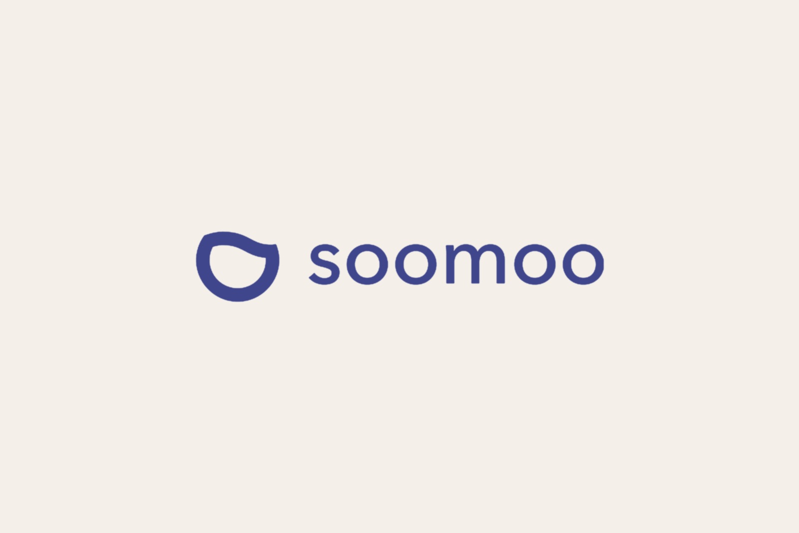
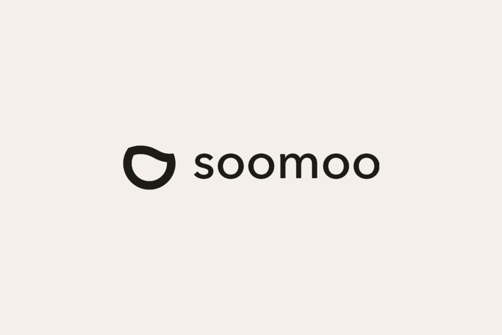
soomoo is a drinkware brand — tea cups and tumblers — and its identity leans entirely on rounded, tactile logic, the way a cup sits in the hand. The icon is an open, slightly irregular oval with a notched interior: at once a vessel, a face, and a glyph. Paired with a lowercase wordmark in a geometric sans, the system reads warm and approachable without tipping into cute.
The doubled ‘oo’ at the centre of the name is part of the design — the letterforms echo the symbol’s circular grammar, and the lowercase keeps the brand from claiming an authority it doesn’t want. For something you hold while you slow down, restraint is the point.
The Mark
The symbol is a single closed stroke — near-circular, interrupted at the top by a gentle break that keeps it from reading as mere geometry. That gap is the detail that makes it feel alive: it implies openness, breath, a gesture held in balance. The interior counter mirrors the outer form, a figure within a figure that rewards a closer look.
Colour is a medium-depth indigo-violet, neither corporate nor casual — quiet conviction. The wordmark shares the symbol’s stroke weight and corner radius, a constraint that makes the pairing feel inevitable rather than assembled. Lowercase sets the register: a name spoken gently, not announced.
Gallery

Outcome
A mark that holds its character at any scale — intimate in small reproduction, assured at display size.